It’s no secret that the conversion rate is essential for any business – no matter the type. It is what aids in growing a business in reaching new heights. However, eCommerce store owners tend to overlook this particular metric.
Conversion rate is important if you want to achieve every goal you have for your store. There are conversion rate hacks to help in improving your business with sales, marketing, and retention.
If you want to improve your conversion rate, this article can help you with that endeavor. Below are the proven ways to increase this aspect of your business to help your eCommerce store scale.
12 Tips For A Higher Conversion Rate (For eCommerce)
Tip #1: Improve Loading Speed
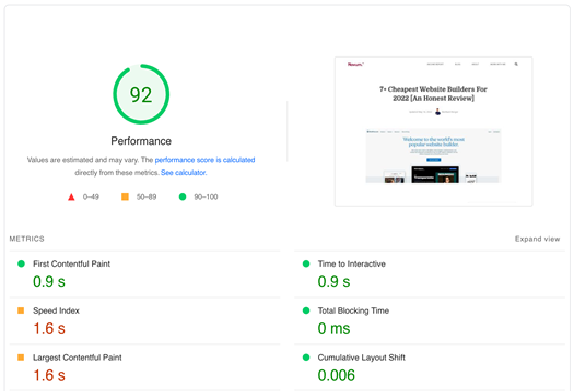
Think of the last time you patiently stayed on a website and waited for it to load. Chances are, you didn’t wait for long. When such a scenario happened, you would have quickly closed the website and gone to another one.
This is the same for most consumers nowadays. When a website loads longer than expected, they quickly move on to the next one. They don’t have the patience to wait for everything to load out.
According to Portent, 0-4 second website load time is the best for higher conversion rates. As for WebsiteBuilderExpert, if you’re running an eCommerce site, the website should load within 3 seconds. They’ve added that if consumers wait longer than that time, some would already resort to abandoning the site.
That is how important website load speed is. You can never efficiently present your products and convert a customer if they don’t stay long enough in your store. So make sure to aim for a faster load speed for your eCommerce business.
Tip #2: Simplicity Of Design Is Much Appreciated
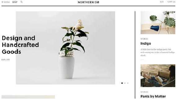
Gone are the days of over-the-top designs for websites to make them stand out. It had its peak moments with website visitors, but today’s landscape has changed. Most eCommerce stores go for a sleek and simplistic design.
When consumers feel that the website is too “noisy” like when the eCommerce store has too many popups and distracting web animation, they might dismiss the site immediately.
Current consumers appreciate a minimalistic design that is still engaging enough to capture their attention. How the eCommerce store would do this will totally depend on the owner.
Most eCommerce stores have chosen simplistic designs because it greatly helps with customer experience. It makes it easy for their customers to scan and navigate the website.
If consumers do feel that way, they will stay longer in your store. And the longer they stay, the more chances of them finding a product or service that fits their needs which helps for a better conversion rate.
Tip #3: Make Navigation Easy To Do
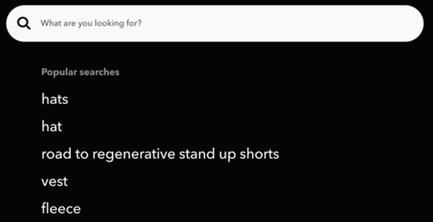
Sometimes, eCommerce stores like to have a lot of web pages for customers to visit. There is nothing wrong with this, but eCommerce store owners need to simplify the navigation process. You wouldn’t want to lose a potential customer just because they couldn’t find the page they were looking for.
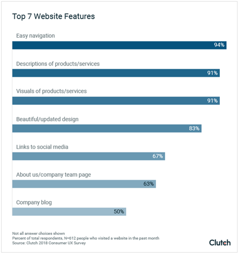
According to a Clutch survey wherein they asked 600+ people which website UX features are important, the feature that came on top was easy navigation. This shows website visitors want to find what they’re looking for with ease.
Additionally, easy navigation helps with improved conversion rates because it helps consumers locate the product or service they are interested in. To help you with this, below are some proven ways to improve eCommerce store navigation.
3.1 Utilize A Search Bar
When using a search bar, just make sure that a relevant product shows up in the results when they type in a keyword. We all have been in a store wherein their search engine doesn’t give any relevant products at all.
To make this search engine effective, make sure this feature is efficient in helping convert your customers.
3.2 Categorize Well
Categories greatly help with navigation because it narrows down your customers' search. When you have a ton of products, consumers will greatly appreciate this initiative. It will make their shopping experience much better.
Tip #4: Have A Dedicated Page For New Arrivals
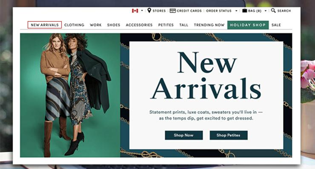
There’s no denying the appeal that a new product brings to a customer. That’s why eCommerce stores (even the big ones) have a dedicated page for new arrivals, products, and services. If you want to improve your conversion rate, consider doing this.
Your new arrivals page should highlight new products in your business. This could be a new seasonal clothing line, a new service, or a new set of collections that your consumers will love. Dedicating a page for these items is an excellent way for you to show these products off without being overly aggressive. It also makes it easier for your customers who only want to shop for newer items.
Tip #5: Fewer Steps To The Checkout Page
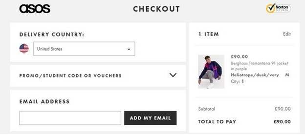
If there’s one thing that consumers hate the most, it would be having to go through various web pages before reaching the checkout page. You wouldn’t want that to happen. Why? Because you are so close to converting, but the process was terminated because of the tons of steps needed to be taken before reaching the payment page.
This particular tip helps you in making your conversion funnel more efficient. Reducing unnecessary steps before reaching the checkout page will ultimately help with the conversion rate.
The steps mentioned here don’t just pertain to lesser web pages, but it also talks about the things that are needed to be done before being able to pay. This also includes filling out forms. So if possible, lessen the fields to be filled out and only ask what’s necessary.
Another thing to be mentioned along the lines of fewer steps would be to lessen the visible buttons when checking out. You don’t want your consumers to be overwhelmed and be confused about where to look when checking out.
You should only let your customers direct their attention on that checkout button to increase your conversion rate. This helps in reducing clutter and also lessens the roadblocks to successful conversion.
It’s important to convey this message to your web developers or to your in-house or software outsourcing team if you’ve created an application for your business.
Tip #6: Detailed Product Descriptions
Although the theme of minimalism is rampant and adopted by many, this shouldn’t be the case for your product descriptions. This is where you want to be as detailed as possible.
It’s already hard enough for consumers not to physically hold and see the product they’re purchasing. To address this, be very intricate with this particular aspect of your store.
Lay down the dimensions of your products, the weight, the material it was made with, the size, the colors, etc. Provide close-up and zoomed-out pictures. Add videos if necessary. These are the things that will help convince consumers that your product is fit for them.
Because if a consumer buys a product from your store and it’s very different from what you presented online, you’ll lose the chance of making them want to come back. This negatively impacts their customer experience with your business.
To help avoid this unfortunate scenario, go for detailed product descriptions. A good example would be from 3Wishes - a costume and lingerie eCommerce store. Look at how detailed their product description is. They mentioned what’s included, not included, and a size guide.
Tip #7: Send Abandoned Cart Emails
There could be various reasons why your customers never got to check out their items. Some never really wanted to check out their carts, while others have legitimate reasons as to why they left them.
To remind the ones who have forgotten about their items, sending cart abandonment emails is a good initiative. According to Moosend, 45% of cart abandonment emails are opened, and 21% are clicked on. Those who went back to your store and successfully checked out their items are added to your conversion rate.
Think of abandoned cart emails as reminders and not a forceful initiative to buy what they have virtually left in your store. This simple reminder can help in improving your conversion rate.
Tip #8: Optimize For Mobile
In today’s eCommerce landscape, you can’t assume that every customer you have uses a desktop to navigate your website. GSMA Intelligence mentioned that there are 5.32 billion unique mobile phone users in the world today. Statista also reported 4.32 billion unique mobile internet users globally – taking up 90% of the total global internet population.
This tells you that there’s a good chance that the number of mobile users that go to your store greatly outnumbers the desktop users. This also means that you should optimize your eCommerce store for mobile and other gadgets.
If you don’t optimize your store, the images will be distorted, website texts will be too big, and the overall website will be unappealing. Consumers might think you’re illegitimate and wonder why your website isn’t working.
So to avoid this situation overall, you should optimize your eCommerce website for any device.
Tip #9: Display Social Proof
One aspect of your eCommerce store that can help with better conversions is leveraging social proof—these positive reviews and experiences towards your business help in a consumer's buying decision.
Trustpilot said that 9 out of 10 consumers worldwide read reviews first before buying a product. I’m guessing you do the same and read up on the experiences of other buyers and see how it went for them. BrightLocal added that 79% of shoppers say they trust online reviews as much as personal recommendations. Lastly, Findstack mentioned that businesses with a minimum of 200 reviews generate twice as much revenue.
Given the statistics behind reviews and social proof, there’s no denying its importance. A lot of people consider these things before buying from your store.
So if you’ve gathered enough positive reviews, make sure to make it seen. That’s an achievement in itself. Let people know that you are legitimate and are excellent at serving your market.
It’s understood that not every review out there is positive. Some negative reviews come from unsatisfied customers. But this doesn’t mean you should just ignore it. Make it a point to go the extra mile in correcting these reviews.
Ask what’s wrong and what happened. Along with your response should be a solution. It’s not enough that you recognize the comment; you should present an answer to resolve the issue. Most importantly, keep your composure at all times. Stay professional. Don’t let emotions get the best of you.
Tip #10: Personalize User Experience
eCommerce personalization has helped businesses have better engagements, traction, and conversion over the years. But this strategy goes beyond just addressing your customers with their first names. Proper personalization offers a whole store experience that they significantly relate to.
One way to offer personalization would be through the content you’re publishing. If you successfully give out personalized content wherein you’ve talked about their specific issues and presented a tailored solution, you can expect an increase in conversion.
Personalized content is a content marketing trick that discusses what your consumers are going through. You are letting them know that you understand their issues and problems through your content. But identifying their issues isn’t the only thing you should be doing. You should also present a solution through your products and services.
This is important because consumers gravitate to businesses that understand what they’re going through. This strategy has been used by small, medium, and big companies worldwide. They utilize this because it simply works.
Incorporate this into your business process and see the results for yourselves. If you run an eCommerce store, you can show personalization by recommending products and presenting relevant services.
This can be shown through your marketing as well. Let your consumers know that you understand their challenges and problems. This style of marketing captures the attention of your consumers almost instantly. It will separate your content from your competitors.
Tip #11: Utilize Value-Adding Videos
Videos are a great way to engage consumers. The most popular ads are in video format and not written. One thing that’s great about videos is that you can incorporate them into your business processes.
First, video marketing is greatly utilized by every business out there. They are a great way to efficiently convey a message and make it more unique and sincere. Letting consumers see facial expressions, human interaction, and gestures makes the overall advertising content more memorable and effective.
Another way to use videos would be on your products page. No matter what industry you’re in, videos are a great way to present your products and services. This makes it more enticing for consumers to buy what you’re selling.
An example of using videos on the product page would be the virtual try-on feature of Zakeke. It lets consumers try out glasses virtually to see if it’s naturally good for them. It’s an innovative feature that leverages video in a great way.
Tip #12: Ask For Honest Feedback
Asking for feedback doesn’t only improve customer service, but also aids in a better conversion rate. Most eCommerce stores tend to overlook this action, not knowing how useful it is in helping improve conversion rate, customer relations, marketing, and overall growth of the business.
Since you can’t physically give the customers a feedback form or a survey, you can do so by giving them when they’re on your website. Usually, these feedback forms don’t get much attention because customers don’t want to waste their time.
Some stores even have a call recording feature where they can record the customers' calls when they have questions, feedback, complaints, or praises.
To make consumers more active in giving feedback, businesses always attach an enticing offer in exchange for the customer’s time. This offer can be a discount, a free shipping voucher, an admission to a high-ticket program, a PDF, a PowerPoint template, or a free consultation.
Once you’ve received your feedback, make sure to act on it. Make the necessary changes in your business following the feedback you have received.
Conclusion
Increasing the conversion rate of any eCommerce business is not an easy feat to achieve. But by doing the proven tips above, you’re on your way to achieving your desired figure for this metric.
For starters, you can immediately implement improving loading speed and simplicity of design. This will make your customers stay longer in your eCommerce store which increases your chances of conversion.


 Table of Content


