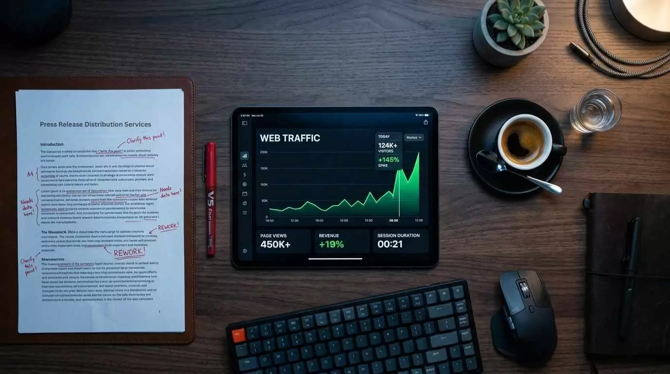
Web design should be the main focus of anyone planning to launch their own website. Likewise, those who are already online should pay attention to the way their website is designed. Even though it seems like the most important thing is to have quality content on your site, you also need to pay attention to how you organize it. This all ties well to User Experience. The more enjoyable and easier to navigate your website is, the more users you’ll have.
As well as that, there’s a higher chance of converting site visitors into paying customers and lowering your bounce rate. In that spirit, here are some things you should definitely avoid in order to achieve the full aesthetics of your website.
1. No updates
Most people think that it’s enough to create their website once and leave it at that. The thing is, trends change and if your website doesn’t follow them, it’s going to be out of the game pretty quickly. Regular updates should be on top of your to-do list.
If it’s been more than five years since you’ve updated your site, the chances are that you’re missing some key factors which attract users. The best thing to do in this situation is to read up on current web design trends and see how you can fit them into your site. Don’t be afraid to tackle WordPress. In some cases, it’s even a good idea to launch a completely new website.
2. Pop-ups
Creating an engaging website is the goal of many, but they approach the issue in a completely wrong way. You may want your users to sign up for your newsletter or register for your website, or see something you think is valuable, but you can’t bombard them with this information. Pop-ups are repulsing for most, and they simply leave if they even see a hint of pop-ups on any website.
Instead of being pushy with pop-ups, you can display the same information at the end of an article or blog post. This way, you’re engaging the user by inviting them to explore further. You’re not forcing them to interact with you by limiting what they see and read with pop-ups.
3. Not being optimized for mobiles
In this day and age, it’s important to realize that most users turn to their mobile phones instead of computers for help. In fact, research has shown that most search queries are conducted via smartphones today. This is bad news if your site isn’t optimized for mobile phones. What does this mean?
Well, simply put, your website needs to work as efficiently on the small screen as it does on the big one. The articles on your website should be neatly displayed, it should have no trouble with pics, and the videos should play smoothly.
If you don’t take this matter into consideration, you can be sure that users are bound to leave your site as soon as they open it. A website or company can’t survive today without supporting the basic needs of its users. Keeping up with the times is your number one priority. Thus, mobile optimization is next on the website improvement agenda.
4. Endless information
If your front page is packed with all of the ideas you’ve ever come up with, and if all the valuable info is placed there too, you can be sure that the users will leave. Too much content packed onto one website can be rather confusing to navigate. Patience wears thin pretty quickly, and before you know it, the user has left the website. The organization is key; especially for websites which have a lot to say.
It can be hard figuring out how to organize your site, which is why most firms turn to professionals like Orion Creative. With a web design firm working with you, you can be sure that your site info will be neatly packed. They’re the ones more familiar with current trends and the ones who will certainly up the level of quality of your website.
Whether it’s making the pages turn with a click of a mouse, organizing the website into neat categories, or doing anything in between, you can be sure that your site is going to be much more compact and easier to read. Instead of putting your users off, it will invite them to explore the premises further.
5. Slow loading
Another problem with landing pages that are packed with information is that they’re extremely slow to load. No one wants to wait an eternity for something to load only to find out it’s practically useless. Your priority should be making your website faster. In the age of sophisticated technology, slow sites are simply not acceptable anymore.
Just put yourself in your users’ shoes. Do you stick around for any website that takes more than a few seconds to load? No. Then why should they? The good thing about making your website faster is that you can easily test the speed yourself. Delete some information, make the loading page lighter, and you’ll notice that the loading speed has significantly increased.
Some choose a completely different design approach, too. For example, you can make your website minimalistic. The bare beauty will be enough to retain the user's attention, and no browsers will struggle to load the info. You’ll also be happy to know that new trends, like using JAVA, are on the rise. With a program like that, you’re able to keep all your animation, pics, videos, and information, without the site loading for ages.
Conclusion
As you can see, designing a website isn’t that simple at all. You have to incorporate your style, needs, and wants with those of your users. Their experience should be your priority. The more user-friendly and well-organized your website is, the more popular you’ll be among the crowd. Add some aesthetics to the mix and you’ve got the perfect website to attract a lot more business. Avoiding these turn-offs will help you avoid failure and achieve more success than you ever thought was possible. Your firm grows with your website, so get to work.


 Table of Content


