 Table of Content
What is a scatter plot?
A scatter plot called a scatter chart or scatter graph is a simple yet powerful data visualization tool that compares two data sets to find a relationship between them.
The data on the plot is shown by plotting dots between the X-axis and Y-axis to represent different values of numeric variables. The independent variable is denoted on the X-axis, while the dependent one is denoted on the vertical axis. The position of each dot on these axes represents values for an individual point. You can analyze the scatter plot by finding out the pattern formed by the plotted dots.
When Should I Use a Scatter Plot?
Choosing the right data visualization tool is very important for you to communicate your real-time information clearly. There are many complex visualizations like Scatter Plot, Sankey Diagram, Likert Chart & Pareto Chart but the Scatter Plot is the best to use when finding correlation between two variables.
So, let’s see the best times when you should use a scatter plot graph to visualize your data.
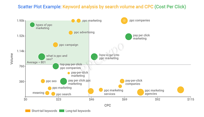
1. To Determine If There Is a Correlation Between Two Variables
Suppose you are trying to figure out what the two variables might mean when put together. In that case, you should plot your data points on a scatter plot to determine the potential relationship between them. For example, you run a sales business, and you are curious to find a pattern for the low sales recently. In this case, you can create a scatter plot to find the relationship between your sales and different factors that might have influenced your sales.
Since your sale is dependent on the other factors, you should plot the data points for your sales on the vertical axis, while the other independent factors on the horizontal axis.
2. When You Have Two Variables That Correlate Well
If you already have any two variables that you think go well together, you should choose to plot them on a scatter plot over any other data visualization tool. This will help you determine if the two variables correlate positively or negatively, non-linear or linear, or strong or weak.
For instance, assume the number of hours worked and money earned. These variables go hand in hand, as the more hours you work, the more money you will make. Therefore, a scatter plot is the perfect data visualization tool for plotting such values and making comparisons.
In this case, the number of hours worked determines the amount of money made. So, hours would be plotted on the X-axis, while money earned on the Y-axis.
3. To Observe the Data Patterns Between Two Variables
As mentioned above, you can use the scatter plot visualization tool to identify a data pattern. The data points can be grouped to determine the patterns, such as if the data set is positively or negatively correlated.
- If your plotted data points slope upwards from the lower-left corner of the diagram towards the upper-right, your scatter plot depicts a positive correlation.
- If your plotted data points fall downwards from the upper-left corner of the diagram towards the lower-right, your scatter plot depicts a negative correlation.
- However, if you see that your data set is neither positively nor negatively correlated, it is considered uncorrelated or null.
4. When There Are Multiple Dependent Values For An Independent Variable
The aim of a scatter plot is to measure and correlate the values of different variables. But when you have more than one dependent value corresponding to a single independent value, scatter plot again comes in handy.
In any data visualization graph, the independent variable is plotted on the x-axis and the dependent variable on the y-axis. Independent variables change naturally and can be controlled by the person drawing the graph, while dependent variables are the ones you want to measure.
For instance, if you wish to find the correlation between age and height, give the scatter plot a shot. In this case, since height fluctuates less than weight, you should plot the height on the Y-axis and weight on the horizontal axis. Now, after placing all the data points, you might observe that you have more than one value of height for the same weight in your data set. Thus, using a scatter plot to analyze such variables with many values is very useful and clearly presents the data.
When Should I Avoid Using a Scatter Plot?
There are situations and certain data sets to avoid using a scatter plot for data visualization, no matter how tempting it may feel to use it. Such situations include-
1. When the Data is Not Related
Some variables seem un-correlated, making it clear that it would be pointless to use a scatter plot to visualize your information.
For example, in a random survey of a students’ classroom, if you try to plot the variables corresponding to the students’ marks in class and the number of vehicles they have at home, it will seem senseless. These two variables are not related whatsoever. So, in such situations, it’s better to look at other data visualization tools, like a bar chart, instead of using a scatter graph.
2. When The Data Set is Too Large
You may have a very large data set that you might want to plot on a scatter graph. However, placing too many data points on the graph can result in overplotting. It can lead the data to clog up your entire scatter plot, making it look like one large blob of ink. This can make analyzing and interpretation of the scatter plot very messy and almost impossible.
Conclusion
Now that you know what a scatter plot is, when you should use it, and when to avoid it, start looking for a good data visualization tool to create your scatter graph today.
You can analyze and present your data with two numerical variables easily and more effectively using a scatter plot. Using this powerful data visualization tool, you can determine the extent of correlation between your two variables to make effective decisions after studying the plot. You might also face challenges while creating scatter plots, like overplotting or interpreting causation as correlation, so you need to do an in-depth scatter plot analysis.