As a digital marketing expert, it's essential to be familiar with diagrams or charts when making crucial decisions that could affect your business.
As a digital marketing expert, it's essential to be familiar with diagrams or charts when making crucial decisions that could affect your business. The advantage you will get from charts and graphs is to make sure you can quickly comprehend bulky information or data.
It's much easier to process information from a pie chart, histogram, or bar chart than trying to comprehend such information through bulky texts.
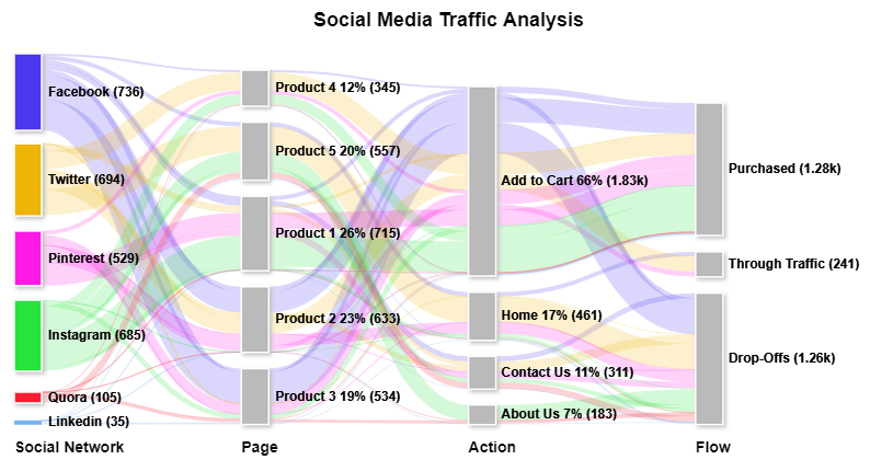
One of such charts or diagrams is the Sankey Diagram which is basically used to represent energy flow. In digital marketing terms, the Sankey Diagram helps us see where we are getting more traffic.
The Sankey Diagram is a flow diagram we use to represent a flow of visitors on a website. In digital marketing, we call the flow of visitors traffic. Basically, the Sankey diagram will help you find out the behavior of people on your website and how you can tweak things around to get more from it.
The Sankey Diagram makes it a bit easier to study a diagram illustrating how many audiences visited your website and how peculiar each of them is. You will be able to find out the country where the highest traffic comes from and the kind of post that leads them to your website. In short, the advantage is to help you focus on how you will get more out of your strength. If you've connected Google Analytics to your blog, you will find out that it's what they use.
You might be wondering if there are any peculiar benefits attached to using the Sankey Diagram that you cannot get from using the standard pie chart, histogram, or bar chart. That's why I am here. The Sankey diagram helps you understand flow processes that could be a bit challenging to get from pie charts. Imagine being able to access drilled-down data. You will get to measure traffic, cost, and social engagements. Also, the Sankey Diagram is easy to use, and you will get to understand your data quite quickly.
Now that you've found out what Sankey Diagram is and why it is better than other visualization tools, let's check out how it can help you in digital marketing.
We are in the 21st century, and the best thing various opportunities we are currently exposed to has offered us is able to understand data more than before.
Marketing has always involved data and information. However, the essential thing is processing the data, hence, using it to promote our business.
There is no better situation than being in your comfort zone, analyzing data to enhance your decision-making.
If there is one thing the Sankey Diagram helps you with, it is to help you make a significant decision in your digital marketing.
Digital marketing is shaped so that you cannot but make decisions from time to time, and these decisions have a way of affecting the growth of your business.
The reason why we've been clamoring for the Sankey Diagram is to minimize decision-making mistakes and to leave out 'guesses' when making decisions that could promote or deprive businesses of growth.
In short, the Sankey Diagram helps you to make fewer guesses and more accurate decisions because you would be working with facts from the data you've generated.
Also, the entire flow of traffic attributed to the Sankey Diagram helps you to rely more on your strength than focusing on your weaknesses. For instance, if you generate more traffic from Texas, you will find out more about the reason behind it and how you can have even more traffic from that area. Hence, you will focus more on getting more engagements in that area. Also, you will find out the top-performing keywords, and you can then focus on them to attract even more traffic and make more profit. Remember, any digital marketing strategy aims to make more profit.
Furthermore, it will help you adapt a converting strategy for other areas in your digital marketing.
Another way the Sankey Diagram can help you is that you can integrate it with Google Ads. As a result, you can get quick insights and view your customers' journey. If you use pay-per-click advertising regularly, you will find it very useful. Instead of struggling with your data, you will visualize your data quite easily.
As much as this tool is an excellent tool that will make digital marketing life more accessible, there are things you should do and things you shouldn't do. The things you shouldn't do are as important as those you should do. Let's check below for those things you should take note of when using the Sankey Diagram:
What you will get from Sankey Diagram is all-encompassing. If you are looking for the best tool to help you make vital company decisions, the Sankey Diagram is your best bet. It can help your digital marketing strategies in several ways.
Whenever you set up a PPC advertising campaign, it's always essential to find out what works. Using the Sankey Diagram is the best method to understand where your traffic is coming from. It also helps you to know the keywords and match types that are converting more.
Remember that the purpose of every PPC campaign is to convert more customers. Therefore, if you want to get the best out of your campaigns, you have to properly process and understand your customers' behaviors. The Sankey Diagram is a tool that can give you everything you need to get the visualization you need on how to improve your all-around decision to move your business forward.