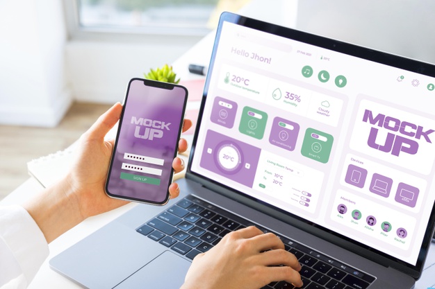
 Table of Content
Are you reading this article on a mobile phone right now? If so, we hope this page looks neatly optimized and this text is easy to read. It certainly should be. Our entire website is optimized for visitors who find us through their mobile phones - and yours ought to be, too. There's more web traffic on mobile phones than there is on desktops or laptops these days, and the gap between the two is going to grow bigger in the future. People increasingly do their web-browsing on the move or from the comfort of their sofas. Laptops are for work. Mobiles are for leisure. Most of your company's potential customers will find you during their leisure time, not their work time.
If you can say with one hundred percent confidence that your business website is optimized for the mobile format, this article doesn't apply to you. If you're not so sure, stick around because we've got some great tips for you. The majority of businesses haven't made material changes to their websites during the past three years, and so they've missed out on a few changes in trends and designs that could be holding their aging sites back. This article will show you which changes you need to make, and why they're important. We won't waste any more time explaining what we're here to do - let's dive right into those tips!

Ditch Adverts
Your website should make your company money, but not through advertising. Have a banner ad on your site if you must, but be aware that it makes your site seem less professional. Do not, under any circumstances, use ads that cover text or other content on scroll-over or via the pop-up. Nobody likes these adverts. They get in the way of the message you’re trying to send, and they make your website appear cluttered and chaotic. They might even drive visitors away completely. Even if they don’t, they’re much harder to deal with on a mobile touchscreen display than they are when you have a mouse to help you find the (often tiny) ‘x’ to shut them down. They’ll slow your page loading time down, and they’ll drive away your visitors. That will cost you more money than the adverts bring in.
Keep It Simple
Minimalism is still fashionable in web design, no matter what anybody says. Cluttered websites are difficult to navigate and make it hard for visitors to identify or locate the content you really want them to find. If you want to see web design at its most basic and potent, find your way to an online slots website. There's so much competition in that corner of the internet that none of the companies who operate online slots websites can afford to put barriers between players and the games they want them to play. We guarantee you that on every such website you visit, you'll find that there's a login screen, brief details of incentives, and immediate access to Playtech slots clearly visible on the homepage. We suspect that, in most cases, there will also be a lack of clutter around the sides. This is not a coincidental thing, and this is the level of simplicity you should look to emulate. Less is more.

Increase Button Sizes
This comes back to what we were saying earlier about difficulties in finding the ‘x’ on adverts. Navigating around menus and links with a mouse pointer is very easy. Navigating around those same menus and links with your fingers isn’t quite so simple if the buttons and links are too small. You’ll have experienced a struggle to select the right option on a website using a touchscreen interface in the past, and we imagine that you didn’t enjoy the experience. Don’t inflict it on other people. One of the key features of the semi-recent Facebook redesign was the introduction of bigger buttons and chunkier menus. Their market research indicated that it would make for a better experience for the majority of users. They spent big money on that research, so trust it and follow suit.
Use Standard Fonts
This advice applies to websites built for desktops or laptops as well, but it's particularly relevant when we're talking about mobile phones. If a visitor arrives at your website and is immediately prompted to download a font in order to make your site display correctly, you've failed as a web designer. You've also lost that customer, as there's no way they're going to download fonts just for your sake. Stick to standard fonts, and don't be tempted by any of the more 'expressive' options. If you want to include a logo, word, or phrase in a specific font for the sake of your aesthetic, do it via images. Even if your visitor's phone doesn't prompt them to download the font you've specified in the build of your site, it will still attempt to display the content using the closest font available to it. That means your site won't appear as you'd like it to appear and will probably look shabby as a result. A nice, clear, tried-and-trusted font might feel like a boring choice, but it's a correct one.
Use The Viewport Meta Tag
You might have seen advice elsewhere that suggests you should use media queries to identify what kind of device your visitor is using and then display your website in the best possible way using a complicated CSS set. That's one way to do it, but it relies on you building specific queries for every possible device. That's a massive job for either yourself or your web designer, and it will need constant maintenance and revision. There's a far easier way to achieve the same thing, and it's known as the viewpoint meta tag. The tag is a one-line addition to each of your pages that tells the mobile browser to fit the page to the screen's available width. Images should re-scale accordingly, and text shouldn't run off the sides. It's a one size fits all solution, and it should result in an adaptive, optimized viewing experience for every visitor.

There really isn't anything more to do it than that. So long as you stick to the principles of minimalism and make sure you're not smearing adverts all over your content or failing to optimize your display size, you should be fine. To be safe, though, always include an option for your customers to view the 'desktop' version of your site if they'd prefer. Some people like things better that way, and it should always be their choice!