 Table of Content
Graphic design has been on the railing for quite some time now. The growing popularity has attracted more and more students or beginners towards the course. Even though it might look simple, the art of graphic designing takes years to grasp and practice. For practicing your craft you could either get a mentorship from amazing graphic designers or join an excellent graphic designer service for internship. It is the constant endeavor to get better at the art that will help you reach unprecedented heights.
So here we are going to discuss about some tips that could help the beginners gradually grasp and polish their art of graphic designing.
1. Font styles and sizes
The elements in the designing might feel like a simple one but is a significant part. The entire idea of graphic design is to create materials that create a dialogue and hence it is a communication material. If your message is not legible and confusing, how will the readers connect to it and have a call to action moment at all? So while selecting the fonts, select a type that will first the project that you are doing, is easy to read and comprehend. You can keep it simple as sometimes that fares well. This doesn't mean you need not experiment, but do it at the edge.
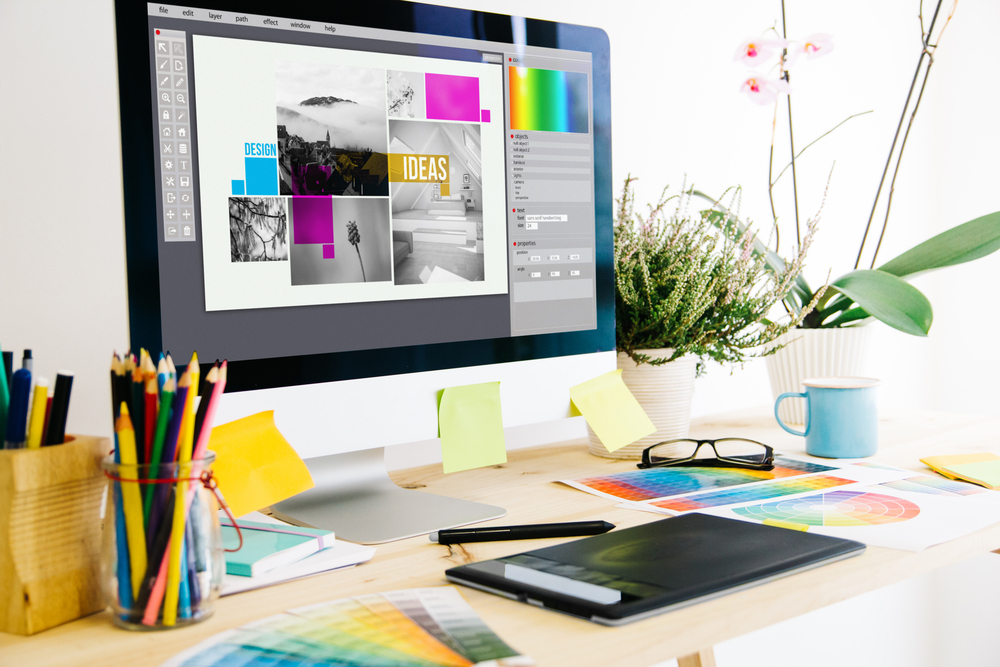
2. Choosing the color palette
It is yet another visual element that needs some care while choosing. The color palette for the matter needs to be selected keeping many attributes in mind. In the end, the collective objective here is to attract the audience and also to have a great first impression. It is a trick to use a very contrasting palette when your test is small and you need all the attention only on that. Something as simple as a color has a great impact in the field of graphic designing. There are some online tools that help in selecting the right color palette for the occasion.
3. White space
This element is usually a valuable one in graphic designing. There are so many designers who try to fill out every white space possible creating an overload of communication. The simplicity in letting the white space be will attract more audience. Once your message is mentioned, there is no need to hoard a lot of design elements in the white space just because there is space. There are so many brands that create and make use of the white space to the most. Simplicity is the key here and it is a golden rule that excellent graphic designer service follows.
4. Selection of images
The graphic design uses a lot of images to portray the message that they are sharing. These images have to be carefully selected. Ensure that the images are all similar in the elements of size, fonts, resolution so that there is a uniformity that is maintained and is displayed all throughout the design. Make sure that the diagrams, images you are using are very relevant and up to date with the information shared through the design.
5. Design Sketch
So if you are sitting around and sketching a design model on paper and you want to get to the computer for further development, the key here is to scan the image. This could be directly imported and added to the applications like adobe illustrator or photoshop directly. The rest of the touch-up and generation could be done in there keeping the background as white. These are simple steps that sometimes cause great confusion and hassle amongst the beginners.
6. Flat design techniques
The field of graphic designing sees a lot of trends all through time and one such trend is the flat line designing. This has actually changed the way people look at graphic design. This trendy way has made it more classy and sophisticated. So to start with such designs you need to be thorough with alignments and spacing altogether. Only when you master them could you bring out some newness to it. Excellent graphic designer service use this technique to create classy designs for the clients.
7. Using style tools
The character and paragraph styles could be used through the toolkit so that it is automated and saves a great deal of time for the designer. Otherwise, there is a constant need to check back and forth about the placement of these characters in the right place in an optimized way. With tool kits and some extensions, these could be put on for checking and monitoring that all the styles are rightly placed.
8. Smart use of italics
This standard rule could save you from a lot of effects. The italics even to this day have a great effect. So you may as well use it to balance out and create a demarcation between headers and subheaders. There is also the need of using them in small sentences only so that there is a difference but not enough to create confusion. Excellent graphic designer service uses this trick to create a division but still retain the newness.
9. Balance is the key
The great design has an eminent page balance. With ample space and right distribution in all corners with white space also included. If it is aligned to one side the attention span can vary, hence the need for a symmetrical age balance is a necessity.
10. Using line separation
Making use of line separation for an exact piece can fetch you a modest piece up to scratch if you are trying hard to make it seem complete. In place of a solid line, try using half lines on either side of a small text filament. The line separation brings in more attention to the matter, so use it wisely.
Conclusion
So these are some tips in graphic designing for absolute beginners. you need not worry about using all of them. Start simple by understanding the different elements and then practice regularly to get better at it.