 Table of Content
One-page websites are very popular these days. Single-page designs allow visitors to consume your content in a way that is engaging and captivating.
One of the main reasons that one-page sites make such an impact on the users’ experience is because they don’t distract visitors with multiple page loads and lead them down a natural and powerful narrative.
With one-page sites, you scroll down, and all the content is under one page. You don’t have to click multiple times to see everything.
However, building a beautiful one-page website that converts requires careful planning and execution.
Here are eight core elements for creating one-page websites:
1. Visual hierarchy
One of the most crucial elements behind good web design is visual hierarchy. It’s the order in which humans perceive what they see. But remember, hierarchy does not come from size alone.
You can use color to highlight the most important parts of your website. Also, keep in mind the other design principles, including typographic hierarchy, spacing, proximity, negative space, alignment, and more.
A visual hierarchy structure will keep your visitors scrolling by providing the info they are interested in. just see that the information you provide on your one-page website is nothing less, nothing more.
Here’s an excellent example of a site that uses visual hierarchy, negative space, and witty copy.
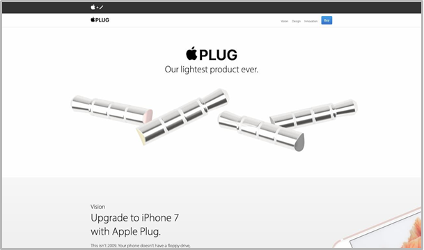
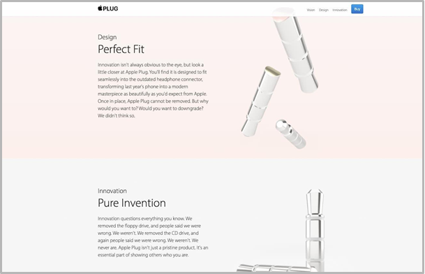
If you scroll through Apple Plug’s page, you’re attracted by the copy and visuals till you reach their signup form.
Unlike other elements, the signup form, the headline, and the CTA button are all in the center so that visitors won’t miss them.
Consider reaching out to a WordPress development company if you are building a one-page WordPress website.
2. Keeping text to a minimum and easy to read
If you fill your one-page site with text above the fold, hardly any user will scroll down the page. Instead, keep text to a minimum. You can focus on bold headlines, short paragraphs, and bullet lists. Consider breaking up text into sections and incorporate them into visuals.
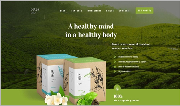
Here’s an excellent example of the neat organization from Be Tea 3.
In some cases, large attractive images can help you sell. Here is another example of a theme from Canva.

They used large attractive images and placed paragraphs of text in the right places.
3. User-friendly navigation
Users will leave your site if they face issues with navigation and scrolling. Design your site’s navigation in a way that will keep users wanting to find out more. Be especially careful with long-form one-pagers.
Consider a horizontal stick menu or a sidebar menu as it makes it easy for users to jump to areas that interest them with one click.
You can even try auto-scrolling navigation links. It allows users to watch a page scroll “on command.”
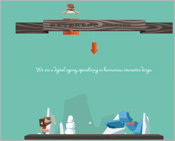
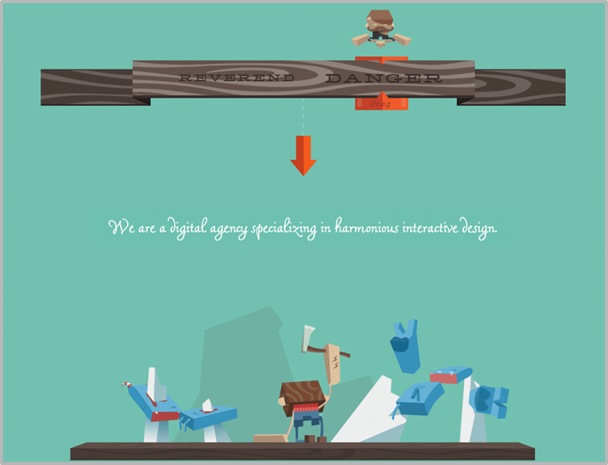
Or you can do it like Reverend Danger, which is a fun and interactive one-page site. If you visit their site, you can select between two themes for how you want to experience the website.
If you choose Reverend, you can have a more passive and calming experience.
If you select Danger, you can have an action movie experience.
4. Prominent CTA
Even as your site structure has more to do with its feel, your CTA represents the first ‘touch’ element. Basically, your CTA is what you would like the users to do on your site. It can be to sign up for an email newsletter, buy a product, or download an e-book.
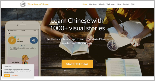
If you don’t add a CTA, it will decrease your site’s effectiveness. Many sites showcase their CTA on the upper fold of the website so that it is easily noticeable. Here’s is an example from Zizzle.
5. Social proof markers
The thing with a one-page website design is that you have to gain your visitor’s trust immediately. You don’t have the opportunity to elaborate on your products and services on different pages.
To gain your visitor’s trust with less content, adding social proof markers is a great way. It also adds a human touch to your site. It could be social media feeds showing your achievements, testimonials from satisfied customers, or snippets and links to publications that speak well of your contributions to your industry.
6. Accessibility features
Accessibility features are curial elements to add to your one-page website. It ensures a seamless user experience even for people with disabilities.
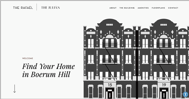
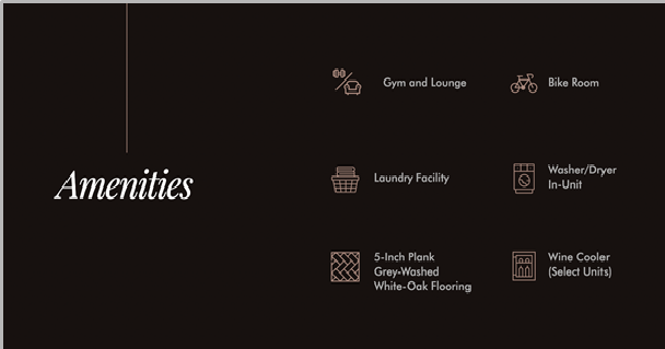
If you look at the property website below, it has seven well-planned sections where you learn about the property, location, amenities, floor plans, and how to get in touch with the leasing agent.
This product-focused website offers a seamless user experience. Additionally, it has accessibility features for users with disabilities.
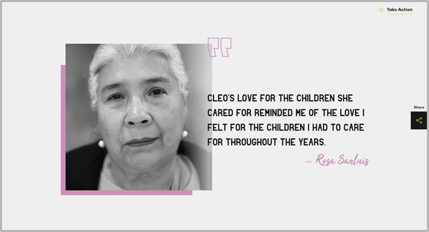
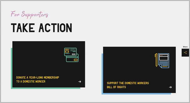
7. Storytelling
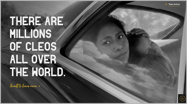
Storytelling can enhance engagement on a one-page website. The website below, which is of the award-winning Oscar-nominated Netflix movie, Roma, is a great example.
The site’s theme complements the gravity of its subject, that is, a better working environment for domestic workers. It also has clear CTA enticing visitors to “Take Action.”
The site uses a storytelling method to offer visitors background info about the movie and its goals. In addition to that, they timed the animations carefully and used scroll effects to intensify the site’s message.
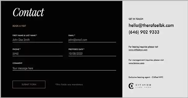
8. Clear contact information
You want to give your potential clients a way to contact you. Many sites use social media icons instead of offering a proper contact form. This is not ideal from a customer service viewpoint as it lets visitors leave your site and navigate to another location.
Instead of that, offer an easy-to-use contact form to retain your potential clients on your website.
Wrap-Up
The one-page website is a relatively new concept. Most websites have more than one page. However, on some occasions, the need to tell an entire story has been fulfilled with a beautifully crafted single page.
A one-page website is just a design concept that takes a single page and divides it into smaller sections while still being able to house a large amount of information.
This article outlined the core elements that can be applied to creating your own one-page website design.