For many prospective patients, your website is the very first interaction they have with your practice. It’s the digital equivalent of your waiting room, your front desk staff, and your initial consultation all rolled into one. If the design is cluttered, the navigation confusing, or the load time slow, that potential patient might click away before they ever see your credentials.
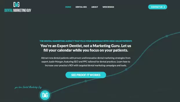
In the competitive world of dental marketing, having a website that merely "looks nice" isn't enough. You need a site engineered to convert visitors into booked appointments. Justin Morgan, widely recognized in the industry as the "Dentist Marketing Guy," has spent years running a dentist website design company. His philosophy centers on the idea that design isn't just about aesthetics; it's about psychology, trust, and removing barriers to entry.
A high-converting website does more than display your hours and location. It answers questions before they are asked, alleviates dental anxiety through visual cues, and guides the user effortlessly toward the "Schedule Appointment" button. Whether you are a general dentist, an orthodontist, or a cosmetic specialist, the principles of conversion-centered design remain consistent.
We have compiled ten essential design tips inspired by industry best practices to help you transform your dental website from a simple brochure into a powerful patient-generating machine.
1. Prioritize Mobile Responsiveness Above All Else

It is no longer a secret that mobile usage surpasses desktop usage for local searches. When someone has a toothache or wants to book a cleaning on their lunch break, they are likely using their smartphone. If your website requires pinching, zooming, or excessive scrolling to find a phone number, you have already lost the battle.
Google uses mobile-first indexing, which means the search engine predominantly uses the mobile version of the content for indexing and ranking. A site that isn't optimized for mobile isn't just annoying for users; it's invisible to search engines.
To boost conversions, ensure your mobile interface features "sticky" headers. This means your phone number and "Book Now" button should remain visible at the top or bottom of the screen, no matter how far down the user scrolls. The path to contacting you should never be more than a thumb-tap away.
2. Speed Is a Feature, Not a Luxury
In the digital age, patience is often in short supply. Studies show that conversion rates drop significantly with every second of delay in page load time. If your high-resolution hero image takes five seconds to load, a significant percentage of your traffic will bounce back to the search results to find a competitor that loads faster.
Dental websites often suffer from "bloat" caused by unoptimized images of smiles, large video files, or excessive plugins. To fix this, you must compress images without sacrificing quality and utilize lazy loading, which only loads images as the user scrolls down to them.
Beyond the technical aspect, speed signals professionalism. A fast, snappy website suggests a modern, efficient practice. A sluggish site can subconsciously signal to a patient that your technology (and perhaps your dental equipment) is outdated. Use Ranktracker to run a website audit.
3. Use Authentic Photography Instead of Stock Images
Nothing kills credibility faster than a generic stock photo of a model with blindingly white teeth giving a thumbs up. Patients are smart. They know when they are looking at a staged photo that appears on hundreds of other dental websites.
To build trust, you need to show the real people behind the masks. Invest in professional photography of your actual office, your real staff, and genuine patient interactions. Show the friendly face at the front desk. Show the comfortable waiting area. Show the hygienists smiling.
Authenticity reduces anxiety. For a new patient, walking into a medical environment can be intimidating. If they have already "met" the team and seen the interior through your website photos, the fear of the unknown diminishes, making them much more likely to book that first appointment.
4. Leverage Social Proof and Video Testimonials
Written reviews are standard, but video testimonials are gold. Seeing a real person talk about their positive experience with your practice creates an emotional connection that text simply cannot match. It validates your claims of "gentle dentistry" or "amazing cosmetic results."
Place these testimonials strategically. Don't bury them on a separate "Reviews" page that no one visits. Integrate them onto your homepage and your service pages. If you specialize in dental implants, place a video testimonial from an implant patient directly next to the description of the procedure.
Furthermore, consider using before-and-after galleries that are easy to navigate. Ensure the lighting and angles are consistent in these photos. High-quality clinical proof of your work acts as the ultimate reassurance for patients considering expensive or invasive treatments.
5. Implement Clear and Direct Calls to Action (CTAs)
A common mistake in dental web design is passivity. You provide information about root canals or Invisalign, but you don't explicitly tell the visitor what to do next. You must guide the user's journey.
Your Calls to Action (CTAs) should be prominent, contrasting in color, and action-oriented. Instead of a vague "Contact Us," try "Schedule Your Free Consultation" or "Get Out of Pain Today."
Avoid "decision fatigue" by limiting the number of choices. If a page has five different buttons asking the user to read the blog, like Facebook, download a PDF, and call the office, the user may freeze and do nothing. On service pages, the primary goal is booking. Make that the hero of the page.
6. Simplify Your Navigation Structure
If a visitor lands on your site and can't find your "Services" or "Insurance" information within three seconds, you have a usability problem. Dental websites often suffer from cluttered navigation menus with too many drop-down options.
Stick to the conventions users expect. A standard menu usually includes: Home, About Us, Services, New Patients (Forms/Insurance), and Contact.
Organize your services logically. If you offer twenty different procedures, group them under broad categories like "General Dentistry," "Cosmetic Dentistry," and "Restorative Dentistry" rather than listing every single procedure in the main menu. The easier it is to find information, the lower the friction, and the higher the likelihood of conversion.
7. Address Dental Anxiety Through Design
Design is emotional. For a dental website, the primary emotion you want to evoke is calm. Aggressive colors like bright red or chaotic layouts can subconsciously trigger stress in patients who are already nervous about visiting the dentist.
Use calming color palettes. Blues, greens, and soft neutrals are industry standards for a reason—they are associated with health, cleanliness, and tranquility. Use plenty of white space (negative space) to let the content breathe. A cluttered design feels chaotic; a clean design feels controlled and safe.
Additionally, consider a "Comfort Menu" or a section dedicated to sedation options if you offer them. Highlighting your commitment to patient comfort front and center can be the deciding factor for a phobic patient comparing you to a competitor.
8. Make Content Skimmable and Patient-Centric
Most visitors will not read your website word-for-word. They skim. They are looking for specific answers: Do you take my insurance? Are you open on Saturdays? Do you treat kids?
Avoid "walls of text." Break up your content with descriptive subheadings, bullet points, and short paragraphs.
More importantly, check your language. Is your copy focused on you or them? Instead of saying, "We have the latest CBCT scanner and utilize advanced variable-torque electric handpieces," try saying, "We use advanced technology to ensure your appointment is faster, quieter, and more comfortable." Translate features into benefits. Patients don't care about the machine; they care about how the machine makes their experience better.
9. Feature a Virtual Consultation or Chatbot Tool
Sometimes a patient isn't ready to call, but they have a quick question. AI-driven chatbots or live chat widgets can bridge this gap. They can answer basic questions about hours and location 24/7, capturing leads even when your office is closed.
For cosmetic dentistry, virtual smile consultation tools are becoming increasingly popular. These widgets allow patients to upload a selfie and receive a personalized video message from the dentist explaining potential treatment options.
This technology engages the patient immediately and requires a low level of commitment from them, serving as an excellent "foot in the door" that often leads to a high-value in-office consultation.
10. Optimize Your "About Us" Page for Connection
The "About Us" page is consistently one of the most visited pages on medical and dental websites. People want to know who will be working inside their mouth. This is a deeply personal relationship.
Do not write a dry biography that reads like a resume listing every university and association you belong to. While credentials are important for authority, your bio should tell a story. Why did you become a dentist? What is your philosophy of care? What do you do on the weekends?
Include photos of the doctor with their family or engaging in a hobby. This humanizes the provider. When a patient feels they "know" the doctor before they walk in, the conversion from website visitor to booked patient becomes much more natural.
Frequently Asked Questions
Why is SEO important for dental websites?
SEO (Search Engine Optimization) ensures your practice appears when local patients search for terms like "dentist near me" or "emergency dental care." Without SEO, even the most beautifully designed website will fail to generate new patients because no one will find it.
How often should I update my dental website?
Technology and design trends change rapidly. A major redesign is typically recommended every 3-4 years. However, you should be making minor updates—adding new blog posts, updating staff photos, and checking for broken links—on a monthly basis to keep the site fresh and functional.
Should I put my prices on my website?
This is a debated topic. Generally, exact prices are difficult to list due to the variability of treatment needs and insurance coverage. However, listing the starting price for fixed-fee services (like a specific teeth whitening package or a new patient special) can be effective. For complex procedures, it is better to emphasize financing options and insurance compatibility rather than sticker price.
What is the most important page on a dental website?
While the Homepage gets the most traffic, the "Contact" or "Schedule Appointment" page is the most critical for conversion. Additionally, individual service pages (like "Invisalign" or "Dental Implants") are vital for capturing patients searching for specific solutions.
Transforming Traffic into Trust
Your website is a living, breathing extension of your dental practice. It works nights, weekends, and holidays. By implementing these ten design tips, you move beyond vanity metrics and focus on what matters: conversions.
Remember that conversion optimization is an ongoing process. Test different headlines, try different photos, and pay attention to your analytics. If you treat your website with the same care and precision you treat your patients, the results will follow.
The goal isn't just to get them to your site; it's to get them into your chair. With a fast, mobile-friendly, authentic, and patient-centered design, you are well on your way to building a thriving practice in the digital age.


 Table of Content


