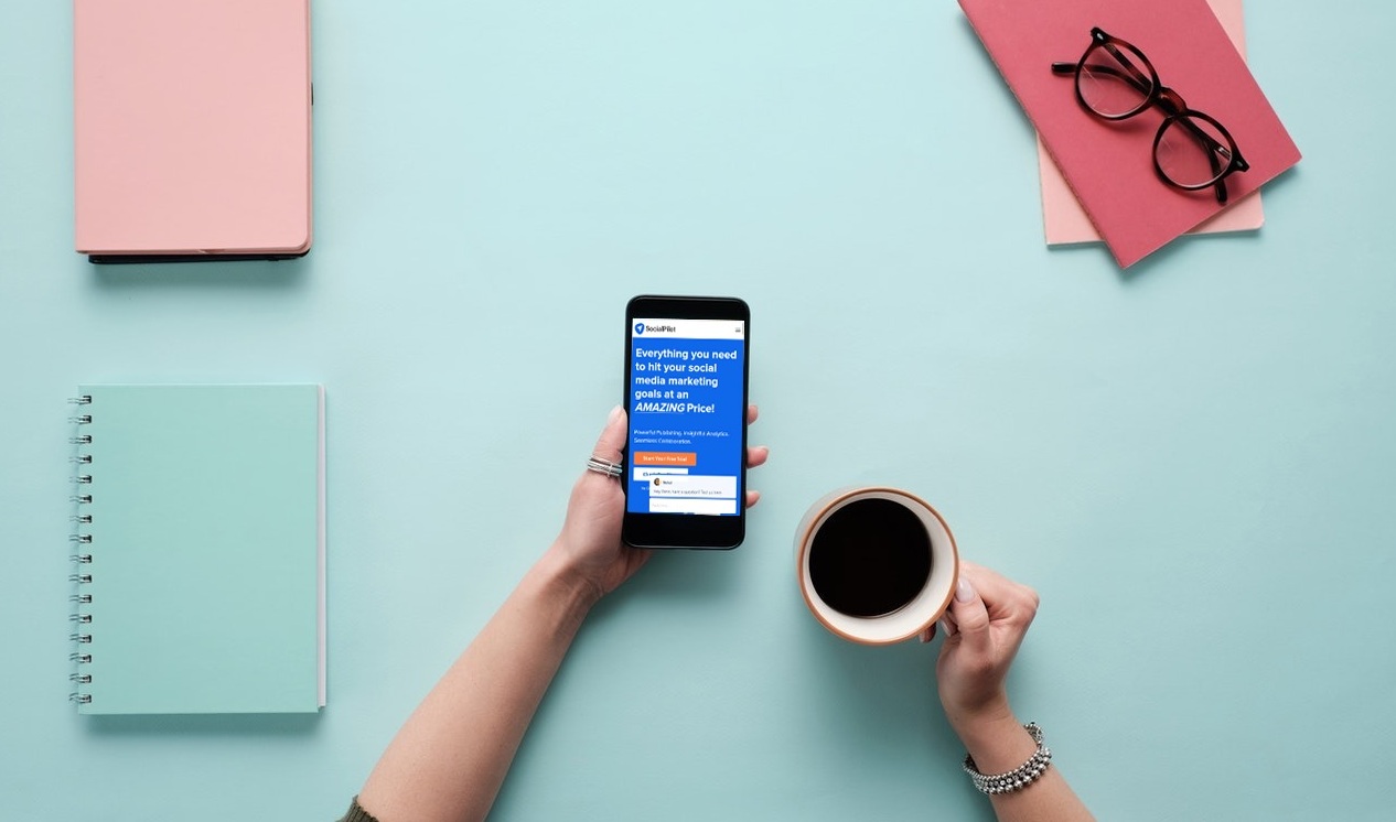
Web design is continually evolving. Let’s take a look at some of the design trends we can expect to see in the next twelve months.
Web design is continually evolving. In the space of 10 years, we have moved from functional one-page sites laboriously constructed using HTML and PHP, to all singing, all dancing website with pop-ups, animation, and crazy graphics. It’s hard to envision where web design is heading, but one thing is certain: it’s sure to be exciting in 2018!
Let’s take a look at some of the design trends we can expect to see in the next twelve months.
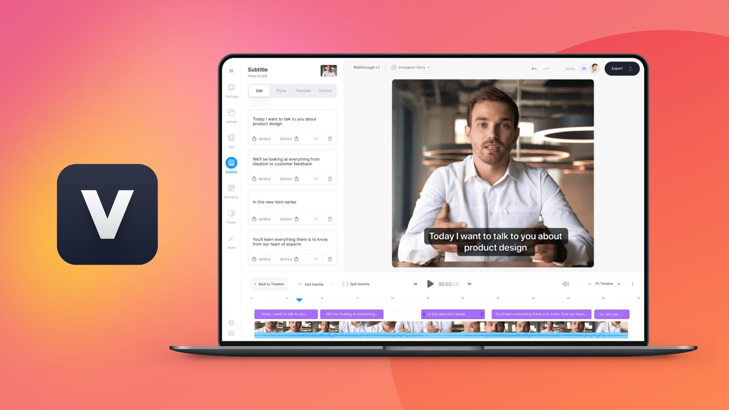
We all know how important video content is. YouTube now has more than 1.3 billion users who consume around five billion videos each day. We love video content, so it makes sense that we are going to see more of it in 2018.
Not all website designers include video in their designs, but as long as you are careful, video content can be remarkably effective. Video can illustrate complex images and information far better than a static photo. For example, imagine you are designing a website for an architect’s firm. Adding a background image of an award-winning building design would convey the beauty of the structure far more effectively than a single image. If you’re unsure about using video, add it below the fold.
Sticky menus are nothing new but expect to see more sticky content in 2018. Sticky menus and navigation features are very popular on e-commerce websites. Instead of expecting customers to scroll back to a menu, make the menu sticky, so it stays in place while the customer reads down the page. This works particularly well if a product has a long description. You can make sure the “buy now” menu stays front and center the whole time.
Square boxes are so last year, dahling. Twitter switched to curved boxes this year, so expect website designers to follow suit in 2018. Gently rounded corners are more sensual and visual appealing. Even Google agrees.
Grids appeal to people who love structure and uniformity. Grid layouts have long been a feature of website design, but there is a move towards broken grid layouts as designers seek to break the mold and challenge convention. There will always be some folk who can’t stand the thought of overlapping images and text, but if you want to step outside of your comfort zone, play around with your website layout, remove hard gutters and allow images to drift into text.
Brutalist themes have popped up in recent years, but mostly on arty websites. Now, though, trend-setting brands such as Balenciaga have introduced a Brutalist theme into their websites. It’s brave, but eliminating the erroneous detail and cutting straight to the chase has won them a lot of new customers.
No, we are not talking about organic food. Organic shapes are the future. Skip the squares and rectangles and embrace oblique shapes and freshen up your site’s perspective.
Whatever changes you make to your website, remember that UX must remain a priority.