The number of false web design doctrines that have proliferated the internet is endless.

The number of false web design doctrines that have proliferated the internet is endless.
The sad part is, a substantial amount of people have accepted these web design myths to be true, therefore, causing them to make wrong decisions about how their websites should be developed.
Considering how important web design is to improve a company’s conversion rate and establish a solid brand image (among other things), you can probably imagine how destructive these web design myths are for a company — if taken as a legit web design principle.
According to Matt Janaway of Marketing Labs, “In the realm of designing websites and creating successful marketing funnels, what worked yesterday could easily be ineffective today. That is why people should always be testing. Because not many people are keen on doing this, they end up falling prey to web design principles that have become outdated and ineffective through time.”
To help you avoid some of the deadliest web design myths, we’re going to share you several of them in this guide.
These myths have wreaked havoc to a good number of companies. At the end of this post, it is our hope that you don’t fall for them.
Let’s get to it.
Myth # 1. Prioritizing Aesthetics Above All Else
A website’s appearance has a huge impact on attracting customers. In his book Emotion Designs, Don Norman proves that attractive things work better.
Stanford University also conducted a study on how people judge a website’s credibility. The results showed that 46.1% out of the 2500+ participants prioritized a website’s visual appeal.
While aesthetics are important, experienced web designers know that it isn’t everything. A website’s structure and functionality should also be prioritized.
There should be a balance between its looks, feel, usability, and its ability to influence its viewers (to take action), for a website to do well.
One example is the use of white space. In previous years, there was a false design myth that white space is equal to wasted space.
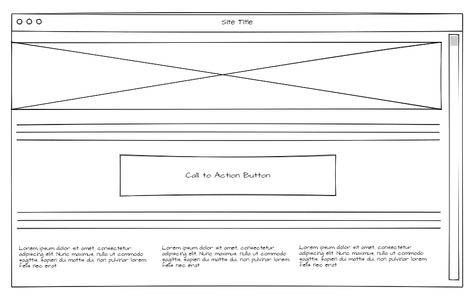
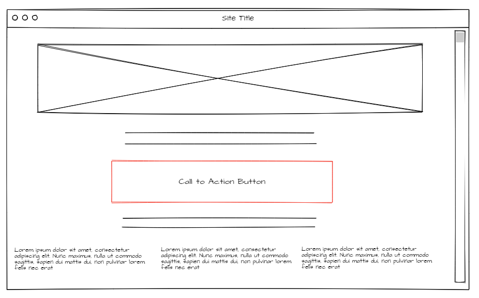
(Website wireframes with white space.)
Swiss designer Jan Tschichold once said white spaces should be regarded as an active element, not a passive background.
It is vital for readability, visual layout, and brand positioning.
It also lets the other elements in your page breathe and get noticed.
Aesthetics help you pass the blink test. Usability encourages your visitors to stay. And these elements make a website a great one.
Myth #2. The homepage is the most important page
Jakob Nielsen, the “guru of Web page Usability,” has long argued that the homepage is the most important element of a website. And because of this, design stereotypes followed this rule.
Recent analytics, however, showed otherwise.
Statistics from Gerry McGovern showed that homepage views have declined over time.
Joshua Porter of Bokardo.com found out that 90% of audiences don’t stay on the homepage after analyzing their UIE website analytics. He also learned that articles get far more views.
This doesn’t mean that home pages are less important. It still serves as the gateway for users to get to where they want to (on your site) and find the information they need.
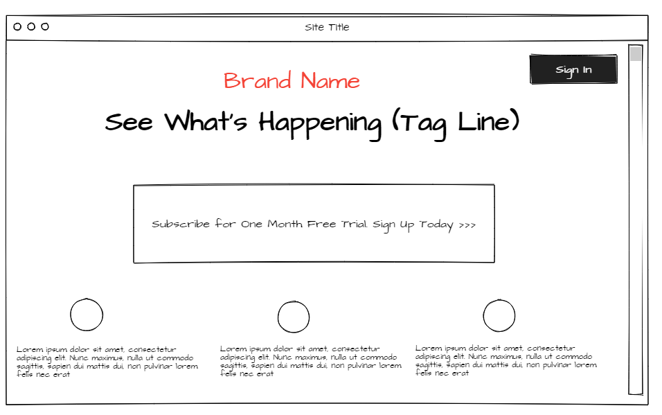
Here’s a good template design that compels visitors to use a company’s trial offer.
So how do you improve your homepage?
Start with the basics: Setting a clear goal and defining its purpose.
Doing so will compel your audience to take action on your CTAs, whether you want them to book a call, subscribe to your list, or sign up to your offer.
Myth # 3. Your website needs to be redesigned periodically.
Most business owners think that revamping a website will increase conversions and get new customers. While this belief may be true, a major revamp can actually hurt the business more if not done correctly.
If you’re a brand that has a fairly good following, users might not be as appreciative of this change as you think.
Jakob’s Law of Internet User Experience mentions that users crave for what’s familiar. They prefer your site to work like all the other sites they’re already used to.
That’s why it’s best to get the basic design right before you launch. And then make minor updates as you go.
If your client already has an existing website, it’s best to get a deeper understanding of their motivations for the change.
Ask them about their current website statistics, their current goals, and future plans.
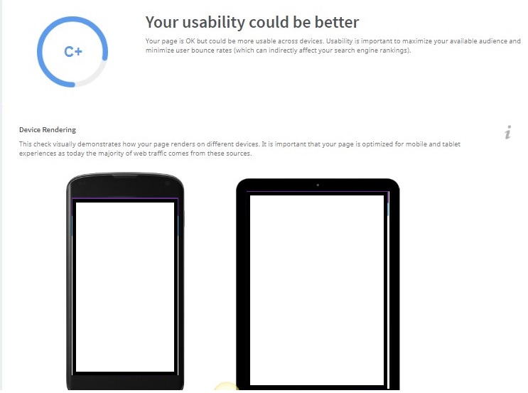
One way to get website data is to use SEOptimer. It’s a website audit tool that gives you website statistics in about 30 seconds.
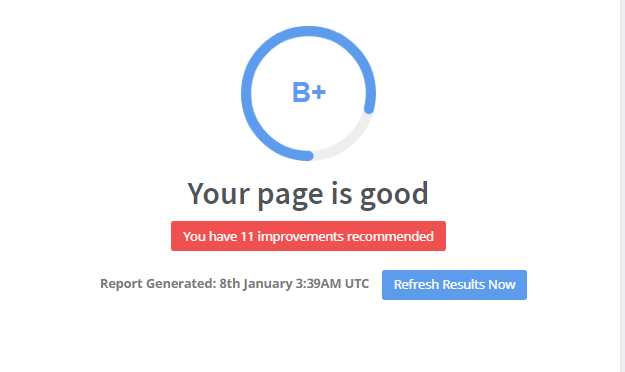
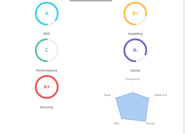
SEOptimer gives you information about the website’s security levels, usability, and performance. With the results, you can gain valuable insights about your clients’ sites, allowing you to map out a better website redesign, marketing funnel, and even improve the site’s CRO strategy.
Myth # 4. The 3 Click Rule.
Some designers still believe the 3 click rule today.
According to this rule, users abandon a website if they don’t find out what they’re looking for in 3 clicks.
Ally Reeves talks about the 3 click rule more clearly in her Medium article. According to her research, most users take up to 12 clicks before they get frustrated and leave.
This shows that the number of clicks doesn’t matter much. What’s important is how productive those clicks are.
We’d like to think that users scan through entire pages when they’re searching for something. Usability tests show people tend to choose that which catches their eyes first.
Crazy Egg is an awesome online tool that can help you identify which parts of your website get the most clicks and views. It also lets you take a peek at how your audience interacts with your website.
A heat map can show how your audience does satisficing. When given tasks, people tend to skim through the content and make easier choices instead of the best ones.
So how can you, as the designer, create the best options for your audience? The best way to go is to provide limited options and creating streamlined, intuitive designs.
Use bulleted lists and narrow paragraphs instead of wider designs. It also helps to highlight the most important information to help users find it easier.
Bonus: Do you really need to test your website?
One common UX Design mistake is thinking that user testing is unnecessary.
Even experts admit that user behavior is hard to predict. Most of the time, users come up with difficult problems that designers never expect.
Usability testing and expert reviews can have different results. This is why it’s recommended to use both to get a better analysis of the interface.
Experts may be good at providing solutions to problems. It’s also possible for them to miss real concerns specific to the targeted user groups.
Reviews from experts usually show if the website passes the general usability standards and usually come before the user testing.
On the other hand, a usability test can also show you how user-friendly your design is. It identifies how users respond to the brand, sales path, and value proposition.
And because people never really go as you expect them, it is absolutely necessary to test your designs so you could see possible issues that will arise.
Conclusion
To sum it up, below are the common web design myths you should avoid if you want to create web designs that convert:
Keep in mind that the key to creating a website that converts is a balance between knowing your target audience, understanding their pain points, and always be testing, testing, testing.
What web design myths did you practice before and how did you debunk it? Share it with us in the comment section below.