
Making memories to inspire action — that’s what marketing is all about.
The call-to-action (CTA) button is the climactic point in a marketing copy, email or otherwise. You want it to catch the reader’s eye. But how do you know if your CTA is worthy of attention?
Create two versions of the CTA and see which one works better — in short, A/B-test it! You spot the better version and stick with it.
Remember, the dollar is in the details. In this post, we’re going to show you how A/B testing can help you become more detail-oriented in your approach to crafting successful email CTAs. So, let’s get started!
The first variable to consider is the CTA text. You want a copy that communicates your message clearly and urgently.
Test both traditional and creative versions of the CTA. Test both first- and third-person points of view.
Traditional CTAs | Creative CTAs |
Learn More | Talk To The Hand |
Buy Now | Give Me The Deets |
Click Here | Count Me In |
Try Now | Show Me The Way |
Go to Product Page | I’m Going In |
Join Now | I Want To Get Healthier |
I’m Interested | That’s Mine! |
Upgrade Now | It’s Your Turn Now |
Activate Today | Yes, I Love Demos |
Use Your Discount | No, I’m Fine |
The above list is just to give you a picture of the variations possible. Needless to say, the context of your email decides the tone of the CTA. So, a CTA like Book A Call has no place in a customer feedback form.
Where should your CTA button be placed?
You want your CTA button to be visible at the very first scroll of your email content. Or better, place it right above the fold. Don’t keep the reader waiting for your content to end to be able to spot it. The reader has already skimmed it and registered the really useful bits of information.
Next, you might want to toy with the alignment of your CTA.
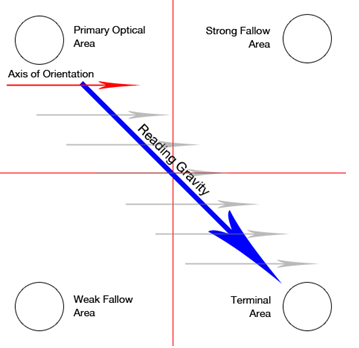
The Gutenberg Pattern. Courtesy: Vanseo Design
It has been suggested that users tend to click right CTAs more than left ones. Eye-tracking studies have shown that users typically follow the Gutenberg pattern while navigating the landing page of a website. But it can be applied to email content as well.
Right away, there is NO one color that can guarantee clicks for you. That’s not the way to go about it. Don’t entertain notions like green stands for positivity and red for danger!
Consider the following case study by Sitepoint.

If one went by the traditional notions about color, green is the obvious winner. However, after testing with 600 subjects, Sitepoint found that conversions shot up by 34% when they used the red button.
The point of choosing the right CTA button color is, first of all, to make it cohere with the visual anatomy of your email; second, to align it with your unique brand palette.
Your choice of color and contrast follows the above considerations.
Too large a CTA button may distance the user to the point of getting annoyed. Conversely, a squint-sized button will require needless effort on the user’s part.
So, is there a standard size? Sadly, no! Different marketers suggest different sizes. For instance, Apple recommends 44 X 44 pixels, whereas for Microsoft it is 36 X 24 pixels.
Regardless, the average CTA button has been found to be 47.9 pixels tall.
Remember that the size of the CTA button should be optimized for both desktop and mobile viewing. Equally, both the font size and the padding i.e. the white space around the text affect the size of the button.
So, if the button and the font are adequately sized, but there isn’t sufficient padding, your CTA will look large and crammed up.
Once you have decided your variables, split your email list into two segments and send each segment a different version of the variable. We recommend testing only one variable at a time.
You can either use random sampling or stratified sampling to split your email list. The former method allocates recipients to a particular segment, whereas the latter method organizes the segments according to the recipients’ location, gender, age, etc.
You can choose from a number of statistical methods to analyze the impact of your variations.
So, for instance, you can use a t-test or a z-test for evaluating the significance level (or the alpha value) and the confidence interval of the test results. The lower the alpha value, the lesser the probability of your results having been due to chance. Which means, you are always aiming for the lowest alpha value.
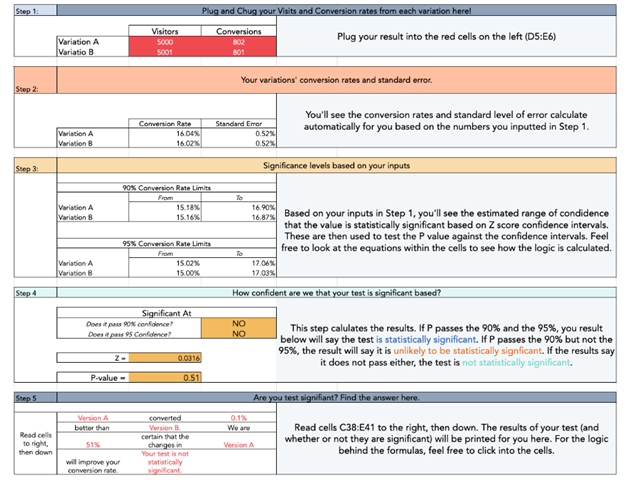
The confidence interval shows you a range of possible values for your metric. The variation with the highest metric value is your winner. Below is an illustration from HubSpot’s A/B Testing Kit.
Once you have a winner, you can use it in your email campaigns and keep tabs on its performance over time.
Every business is unique; there is no one-size-fits-all approach. Hence the need for testing everything. A CTA is a call to action. A/B testing is the way to make sure which of your calls is being heard.